Color Is Your Loudest Design Decision — Here's How to Get It Right
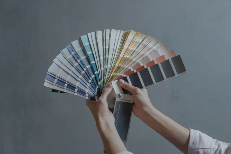
Before a visitor reads a single word on your website, they've already formed an opinion. Not about your copy. Not about your layout. About your color.
Research from the Institute for Color Research suggests that people make a subconscious judgment about a product within 90 seconds of initial viewing — and up to 90% of that assessment is based on color alone. That's a wild stat, and it should make every web designer sit up a little straighter.
So let's talk about what's actually happening in your visitors' brains when they land on your site, and how you can use that knowledge to make smarter palette choices.
Why Color Isn't Just About Looking Pretty
Here's the thing about color psychology: it's not a soft, fuzzy concept. It's rooted in decades of behavioral science and marketing research. Different hues trigger measurable emotional and physiological responses. Blue lowers heart rate and builds trust — which is exactly why you'll see it dominating the banking, healthcare, and tech industries. Red creates urgency and stimulates appetite, making it a go-to for fast food brands and clearance sales. Green signals growth, health, and environmental responsibility.
But here's where a lot of designers go wrong: they treat these associations as universal rules rather than cultural starting points. Color meaning shifts depending on your audience's background, age, and even geographic location. In the US, white traditionally signals cleanliness and simplicity — think Apple's minimalist aesthetic. But context matters enormously, and your specific audience demographic should always inform your interpretation of these associations.
Matching Your Palette to Your Industry (Without Being Boring)
Let's be real — when every financial services website uses navy blue and white, the category starts to feel like a sea of sameness. The goal isn't to blindly follow industry conventions; it's to understand why those conventions exist and then decide whether to lean in or strategically break away.
Take the wellness space. For years, brands defaulted to sage green and soft lavender to signal calm and naturalness. Then along came brands like Hims and Hers, which injected bold, almost pharmaceutical-grade color confidence into their palettes. The result? They stood out instantly in a crowded market while still communicating cleanliness and credibility.
The sweet spot is this: use your industry's color language as a foundation, then differentiate through saturation, pairing, and application. A fintech startup can still use blue — but a deeper, more electric cobalt paired with warm off-white reads as innovative rather than stuffy.
The Conversion Connection
If you need a business case for investing time in your color strategy, look no further than A/B testing data on call-to-action buttons. HubSpot famously ran a test showing that a red CTA button outperformed a green one by 21%. But before you paint every button red, understand the context: that result was specific to that audience, that page, and that moment. What it actually demonstrates is that contrast and visual hierarchy drive clicks more than any single color.
Your CTA needs to pop against the surrounding elements. If your site is predominantly blue, an orange button will grab attention far more effectively than a slightly different shade of blue. This is color contrast working for you, not against you.
Accessibility is another conversion factor that gets overlooked. The Web Content Accessibility Guidelines (WCAG) recommend a contrast ratio of at least 4.5:1 for normal text. Designs that fail here don't just alienate users with visual impairments — they create a frustrating experience for anyone reading on a bright screen outdoors or on a low-quality monitor. Tools like Coolors and Adobe Color have built-in accessibility checkers that make this easy to verify.
Real-World Color Wins Worth Studying
Look at Mailchimp's website evolution. Their signature yellow is bold, warm, and a little quirky — a deliberate choice that separates them from the cold, corporate blues of enterprise software. That yellow communicates approachability and creativity, which is exactly what small business owners and independent creators want to feel when choosing an email marketing platform.
Or consider Peloton's use of black and white with high-contrast red accents. It feels premium, intense, and aspirational — all the emotional cues that support their positioning as a luxury fitness brand. Nothing about that palette is accidental.
On the e-commerce side, Allbirds leans into earthy, muted tones across their product pages and site design. It reinforces their sustainability narrative without a single word. The palette is the message.
Building a Palette That Actually Works
When you're starting from scratch — or auditing an existing site — try this framework:
Step 1: Identify your emotional intent. What do you want visitors to feel within the first five seconds? Write it down before you open a color picker.
Step 2: Choose a dominant color that aligns with that emotional intent and your industry context. This should occupy roughly 60% of your visual space.
Step 3: Select a secondary color that complements or contrasts your dominant hue. This appears in UI elements, section backgrounds, and supporting visuals — about 30% of your palette application.
Step 4: Pick an accent color for CTAs, highlights, and interactive elements. It should be high-contrast and used sparingly (that final 10%) so it retains its attention-grabbing power.
Step 5: Test with real users. Preference tests on platforms like UsabilityHub let you gather feedback on color options before you commit to a full build.
The Bottom Line
Color strategy isn't a step you squeeze in at the end of a design project. It's a foundational decision that shapes perception, drives behavior, and communicates your brand's entire personality before a user reads a single headline. Treat it with the same rigor you'd apply to your typography choices or your navigation structure.
The most beautiful websites aren't beautiful by accident — they're beautiful because every decision, including color, was made with purpose. Start there, and your palette will do more work for you than you ever expected.