Off-Balance on Purpose: How Asymmetrical Layouts Are Redefining Modern Web Design
There's something almost counterintuitive about it. You'd think a website that's perfectly balanced — elements mirrored cleanly on both sides, everything centered and predictable — would feel the most professional. Controlled. Finished. But spend a few minutes scrolling through the portfolios of top-tier design studios or the landing pages of brands that are genuinely setting trends, and you'll notice something: the sites that stop you mid-scroll are almost never the perfectly symmetrical ones.
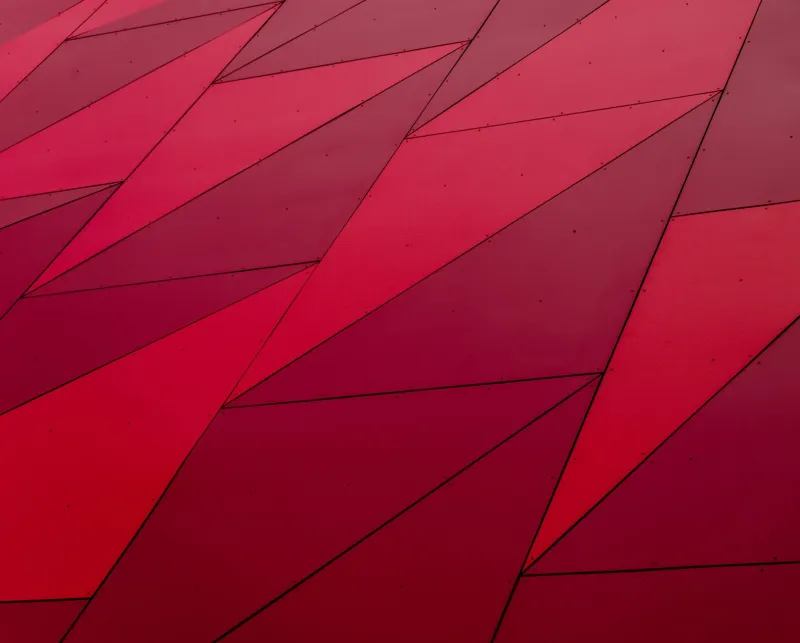
They're the ones that feel slightly off. A headline that bleeds into the left margin. A product image that anchors hard to one side while white space breathes freely on the other. A bold typographic block sitting above a photo that doesn't quite align with it. These layouts look like they were made by someone who knew exactly what they were doing — and broke the rules anyway.
That's the asymmetry advantage. And it's worth understanding why it works.
Why Our Brains Actually Prefer the Unexpected
Symmetry is comfortable. It signals safety and order, which is probably why it dominated early web design — designers were trying to establish trust, and nothing says "we're reliable" quite like a perfectly centered logo flanked by two identical nav columns.
But comfort and engagement are different things. Cognitive scientists have long noted that our brains pay closer attention to things that deviate slightly from expectations. It's called the von Restorff effect — we remember what stands out. An asymmetrical layout introduces just enough visual tension to keep the eye moving, to make the viewer feel like they're discovering the design rather than just scanning it.
That sense of discovery is exactly what makes asymmetry feel modern. It suggests intention. A perfectly symmetrical layout can look like a template. An asymmetrical one looks like a decision.
The Brands Doing This Right
Take a look at how some of today's most design-forward companies are using asymmetry in practice. Stripe's marketing pages are a great example — product screenshots and UI previews are often set at angles or offset from their text counterparts, creating diagonal visual energy that keeps things dynamic without ever feeling chaotic. Apple, too, has leaned into asymmetry on product launch pages, placing device imagery off-center to draw the eye across the full canvas.
Smaller studios and independent designers are often even bolder. Awwwards-winning sites regularly feature layouts where a dominant element — a massive numeral, a full-bleed photo, a single oversized word — anchors one side of the screen while the rest of the content clusters asymmetrically around it. The effect is editorial, almost magazine-like, and it communicates a level of design sophistication that grid-locked layouts simply can't match.
The Grid Is Still Your Friend (Seriously)
Here's the thing that trips up a lot of designers when they first experiment with asymmetry: they abandon structure entirely and end up with a layout that looks unintentionally messy rather than deliberately bold. The secret is that asymmetry works because of the underlying grid — not in spite of it.
You're not throwing out your 12-column grid. You're using it differently. Instead of distributing content evenly across all 12 columns, you might give a hero image 8 columns and let your headline text sit in just 4. Or you might offset a pull quote so it spans across the gutter, breaking the column boundary in a way that feels intentional precisely because everything else respects it.
Think of it like jazz. The reason an unexpected note sounds interesting rather than wrong is because the musician knows the scale — and the listener can feel that knowledge underneath the improvisation.
Practical Ways to Introduce Asymmetry Without Losing Usability
Start with one asymmetrical element per section. Don't overload a layout with competing off-kilter choices. Pick one relationship — a text block and an image, a headline and a decorative element — and let that be the asymmetrical moment. Keep everything else clean.
Use scale contrast as your primary tool. One of the easiest ways to create asymmetry is through dramatic size differences. A massive headline on the left paired with a small supporting paragraph on the right creates instant visual weight imbalance — and it guides the eye naturally from big to small, which is exactly the reading hierarchy you want.
Let white space do the heavy lifting. Asymmetry doesn't have to mean crowded. Some of the most striking asymmetrical layouts are actually quite sparse — they just distribute that emptiness unevenly. A product photo pushed to the far right with a wide-open left side isn't just asymmetrical; it's breathing.
Anchor with a strong vertical. When everything feels like it's floating, a strong vertical element — a full-height image, a thick rule, a tall column of text — gives the eye a place to rest and makes the surrounding asymmetry feel intentional rather than accidental.
Test on mobile early and often. Asymmetrical desktop layouts can collapse in unexpected ways on smaller screens. Make sure your breakpoints are planned so that the intentional tension of your desktop layout doesn't turn into a confusing stack on a phone.
When to Pull Back
Asymmetry isn't always the right call. Content-heavy sites — news platforms, documentation pages, e-commerce catalogs — often need the predictability of symmetrical layouts because users are scanning for information, not experiencing a design. In those contexts, visual surprise can actually slow people down.
The sweet spot is sites where the design itself is part of the message: portfolios, brand landing pages, marketing sites, and editorial content. Anywhere the visual experience is meant to communicate something about the brand's personality, asymmetry is a powerful tool.
The Takeaway
The most modern-feeling websites aren't the ones that achieved perfect balance — they're the ones that understood balance well enough to break it strategically. Asymmetry signals confidence. It says the designer knew the rules and made a deliberate choice to push against them.
That's a message worth sending. And it turns out, it's a message that looks really, really good.