Less Is Somehow More: The Surprising Science Behind Generous Whitespace in Web Design
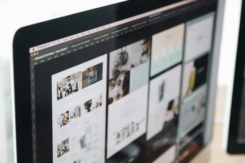
There's a moment every designer knows well. You've laid out a clean, spacious page, and someone — a client, a stakeholder, maybe your own anxious brain — looks at it and says, "It feels kind of empty. Can we add something here?"
The instinct makes sense. More content should feel like more value, right? Turns out, that's almost exactly backwards. The counterintuitive truth is that generous whitespace doesn't make a page feel empty. It makes it feel expensive.
What Negative Space Is Actually Doing
Negative space — the breathing room between elements, around text, inside margins — is one of those design tools that works precisely because most people don't consciously notice it. Users aren't thinking "wow, that's a lot of padding." They're thinking "this site feels really clean" or "I trust this brand" without knowing why.
The psychology behind this is well-documented. Our brains associate visual clutter with low value and scarcity with premium quality. Think about how a discount grocery store looks versus a Whole Foods. One stacks product floor-to-ceiling; the other gives each item room to breathe. You already know which one charges more — and which one you trust more when you're buying something you actually care about.
The same dynamic plays out on the web, every single day.
The Luxury Brand Playbook
Spend five minutes on the websites for brands like Apple, Rolex, or Aesop and you'll immediately feel the difference that whitespace makes. Apple's product pages, for example, are famously sparse. A single product image. A headline. Lots of open sky above the fold. No competing calls to action, no banner ads, no sidebar widgets screaming for attention.
The result? Your eye knows exactly where to go. Your brain interprets the spaciousness as confidence — as if the brand is saying, "We don't need to shout. The product speaks for itself."
This isn't accidental. It's a deliberate choice to use restraint as a signal of quality. And it works in contexts well beyond luxury goods.
SaaS Platforms Are Getting the Memo
Look at modern SaaS design — tools like Linear, Notion, or Stripe's marketing pages — and you'll see the same principle applied in a more functional context. These aren't jewelry brands or fashion houses. They're software tools. But they've figured out that whitespace isn't just a luxury aesthetic; it's a usability feature.
When a pricing page gives each tier room to exist on its own, users can actually compare options without their eyes bouncing all over the screen. When a dashboard uses generous spacing between data points, the information becomes scannable instead of overwhelming. The content doesn't disappear — it becomes easier to process.
Stripe's documentation pages are a great example of this. The actual code content is dense and technical, but the surrounding layout is airy enough that you never feel buried. That balance is harder to pull off than it looks.
The Hierarchy Payoff
Here's something designers sometimes miss: whitespace doesn't just make pages look prettier. It actively creates information hierarchy without requiring you to add any extra visual elements.
When you put more space above a heading than below it, you're visually grouping it with the content that follows. When you add extra padding around a call-to-action button, you're telling the user's eye that this element matters. You're creating emphasis through proximity and distance, not just through color or size.
This is whitespace doing real structural work. It's organizing your content in a way that guides users through a page in the order you want them to experience it.
Practical Techniques to Try Right Now
Ready to give your own layouts more room to breathe? Here are a few approaches worth experimenting with:
Increase your base line-height. Most developers default to something around 1.4 or 1.5 for body copy. Try bumping it to 1.6 or even 1.7. The text becomes noticeably easier to read, and the whole block of content feels lighter.
Double your section padding. Whatever vertical padding you're currently using between major page sections, try doubling it. This is often the single fastest way to make a layout feel more polished and intentional.
Give your CTAs room. If your call-to-action button is crammed up against body text or another element, it loses visual weight. Surround it with space and it becomes a destination, not an afterthought.
Embrace the empty column. On grid-based layouts, consider leaving a column intentionally empty — especially on landing pages. An asymmetrical layout with open space on one side can feel dramatically more sophisticated than a fully packed grid.
Audit your margins on mobile. Whitespace isn't just a desktop concern. On small screens, cramped margins make content feel stressful to read. Even adding 8–12px of extra horizontal padding can transform the reading experience on a phone.
The Counterargument (and Why It Doesn't Hold)
The most common pushback is that whitespace wastes screen real estate — that users have to scroll more, and scrolling is friction. This argument made more sense in 2004, when users were still anxious about scrolling past the fold. In 2025, scrolling is second nature. Users scroll Instagram, TikTok, and long-form articles without a second thought.
What users don't tolerate is confusion. They'll scroll all day if the content is clear and engaging. What they won't do is stick around on a page that feels overwhelming or hard to parse.
Given the choice between a dense page that requires less scrolling and a spacious page that's a pleasure to move through, most users — and most conversion rates — favor the latter.
Space Is a Design Decision, Not a Default
The biggest shift in thinking about whitespace is recognizing it as something you choose, not something that just happens when you run out of content to add. Every pixel of empty space on your page is a decision. When you treat it that way — when you use it deliberately to guide attention, signal quality, and reduce cognitive load — it stops being empty and starts being essential.
The paradox is real: the more intentional space you give your content, the fuller and richer your page will feel. Not in spite of the emptiness. Because of it.